top of page

Andy Capp's Rebrand
Insight
Andy Capp's is a unique alternative to potato chips that took the look of french fries and made them crunch like potato chips.
Objective
The classic snack brand is lacking appeal to draw in the consumer to purchase their Andy Capp's Fries.
Solution
Give the classic fries a unique look that will help them stand out against its competitors while retaining a nice modern look that will attract more consumers than its competitors.
Logo | Packaging | Ads | Website | Social Media


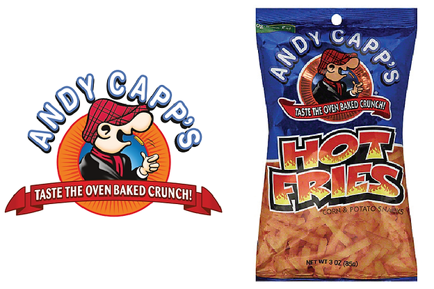
Andy Capp's older design before rebrand
bottom of page